hierarchy
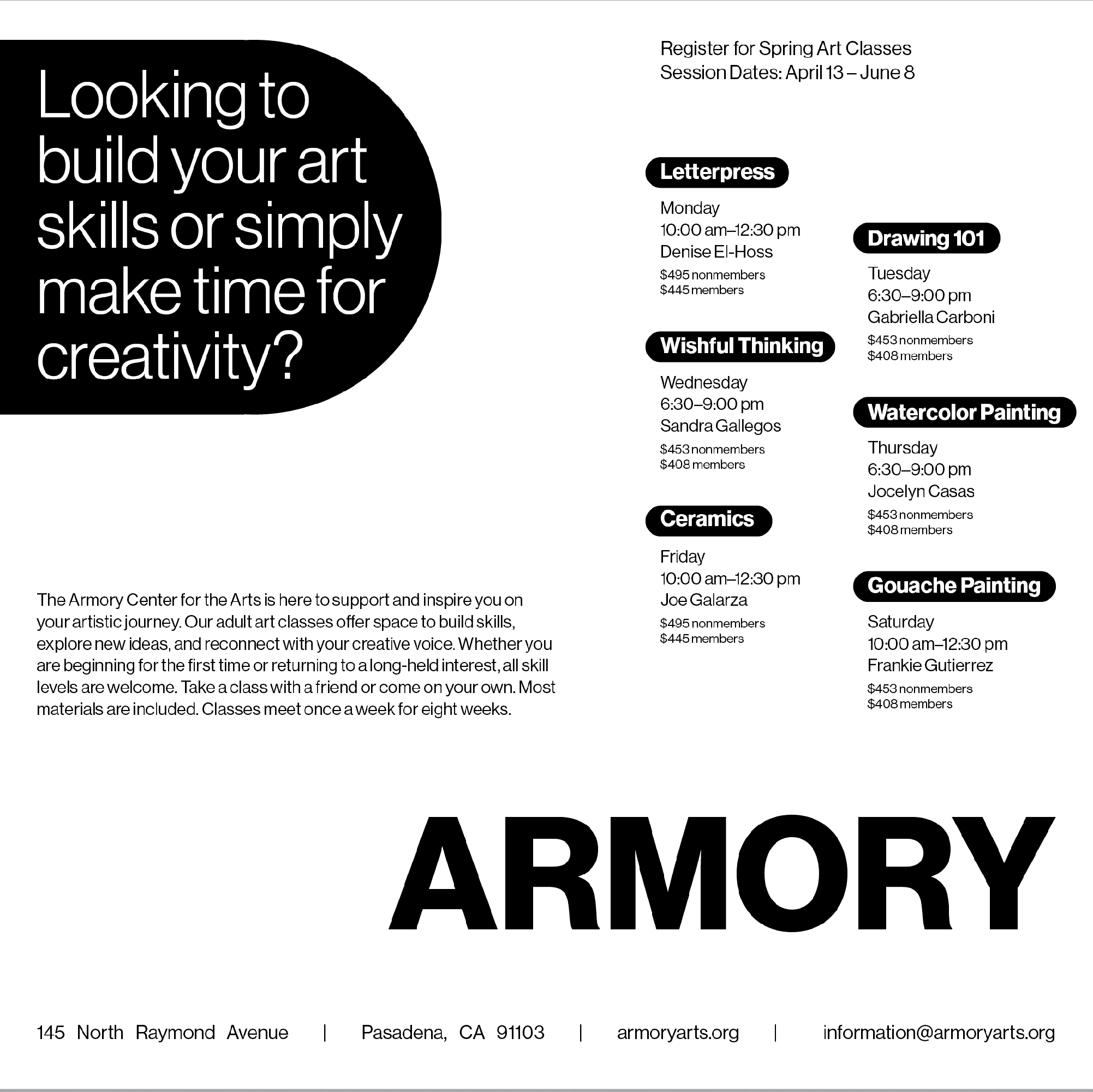
This project explores typographic hierarchy through five iterations of a single flyer for Armory Center for the Arts. Each version experiments with layout, scale, spacing, and simple graphic elements to direct attention and organize information. By reworking the same content using only type and minimal forms, the project demonstrates how hierarchy alone can shape clarity, emphasis, and visual flow.
Dimensions: 8" x8"
Materials: Laser-printed letter paper
Tools: Adobe InDesign